About the Brand
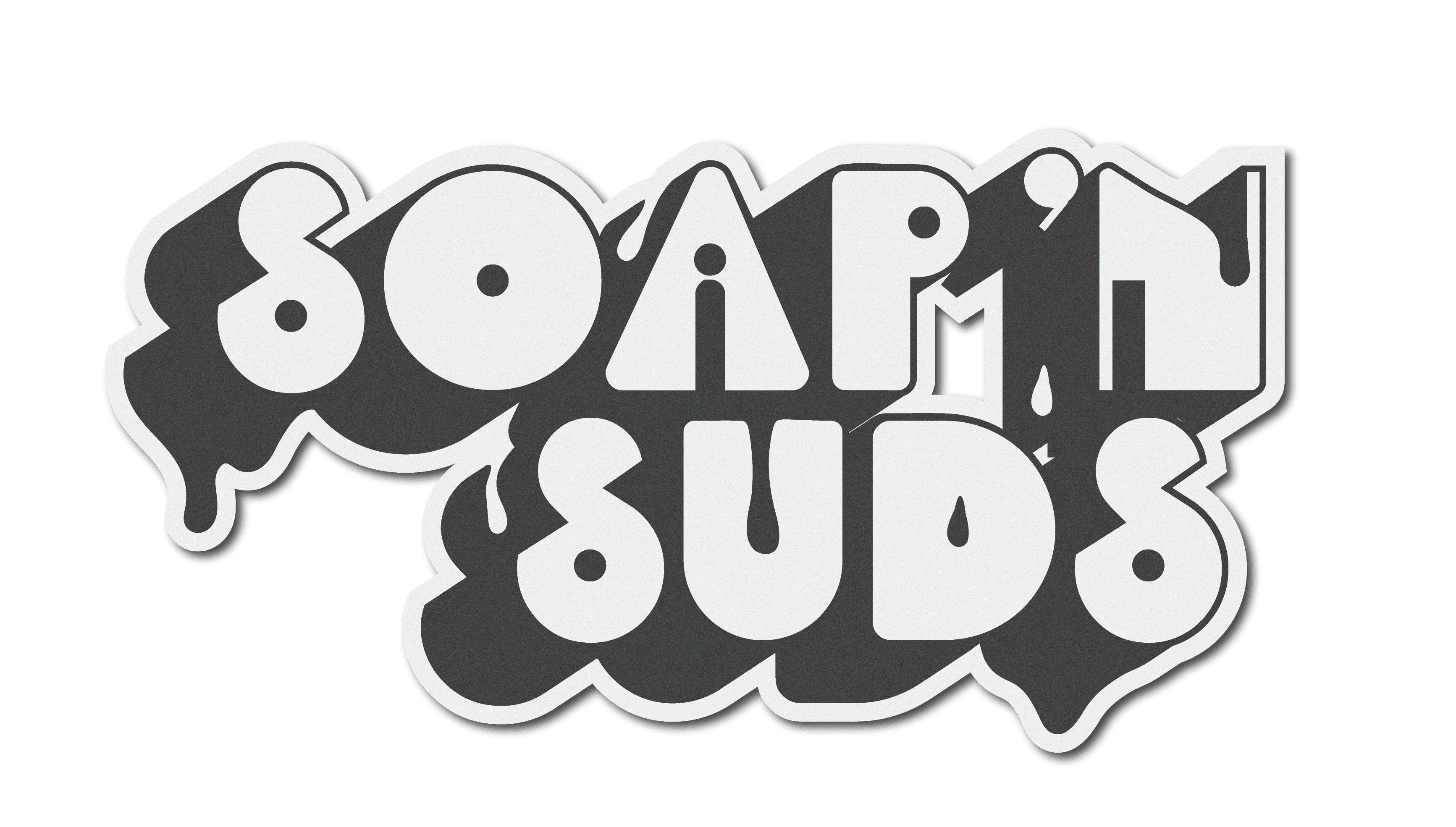
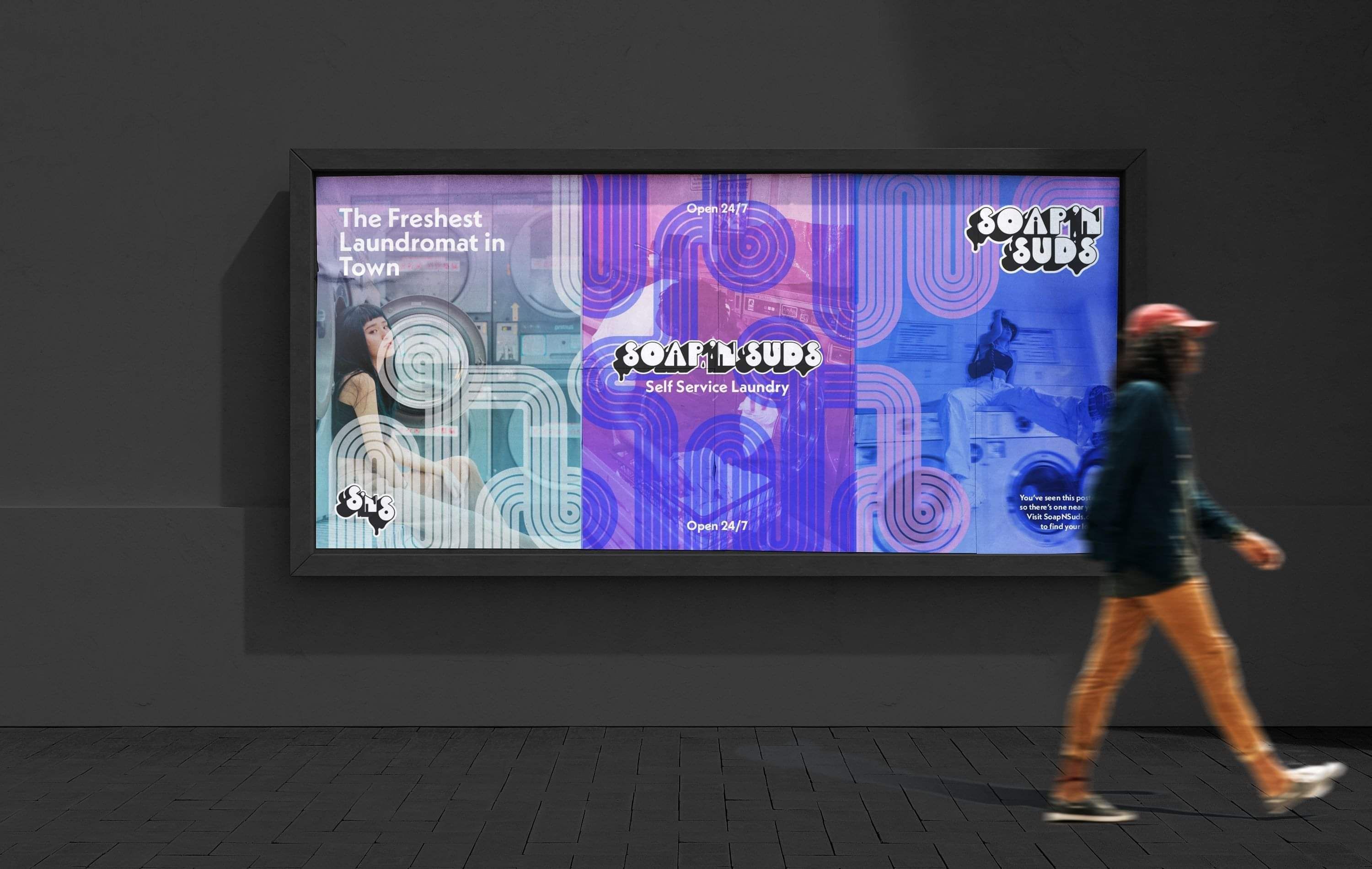
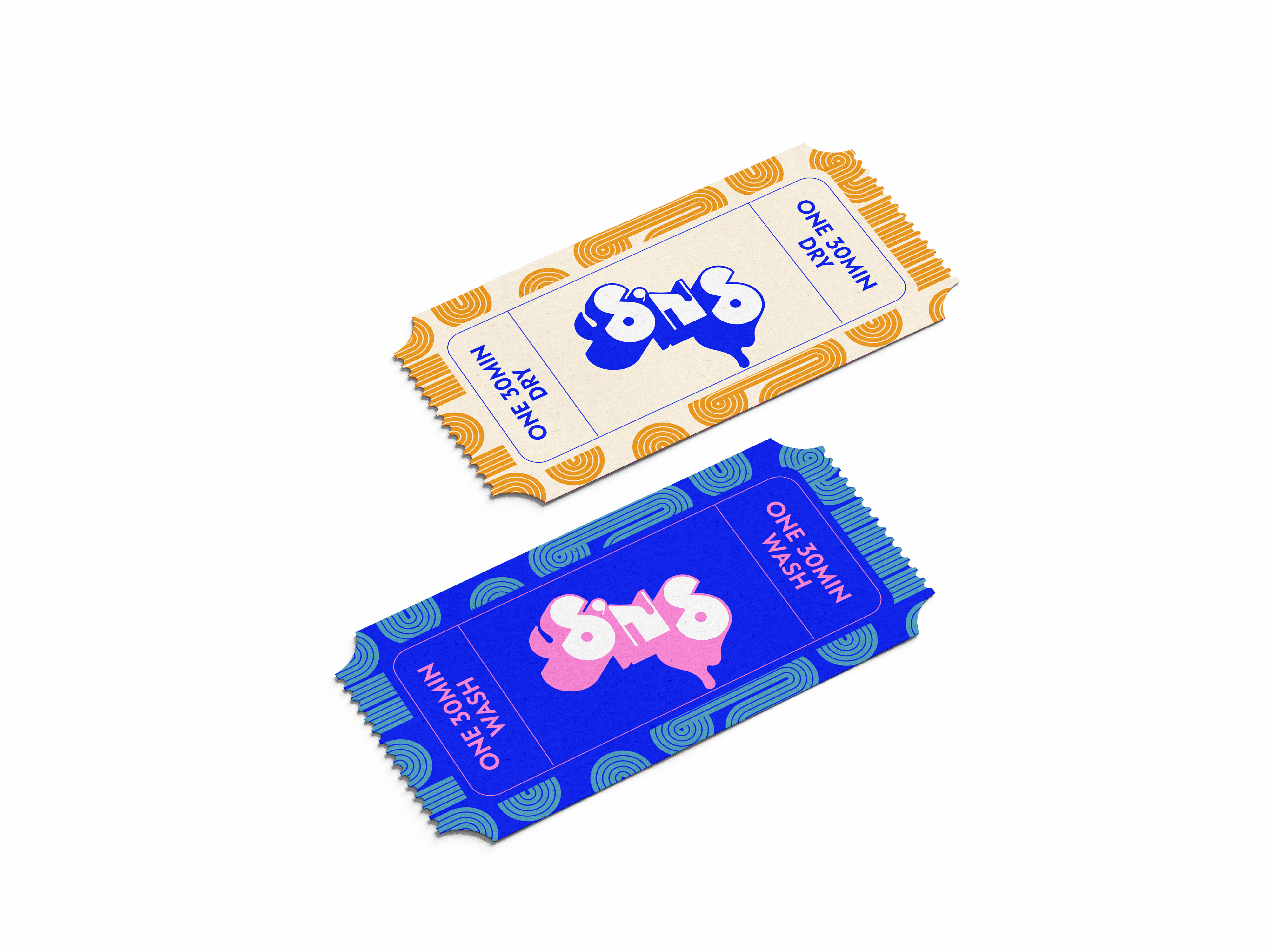
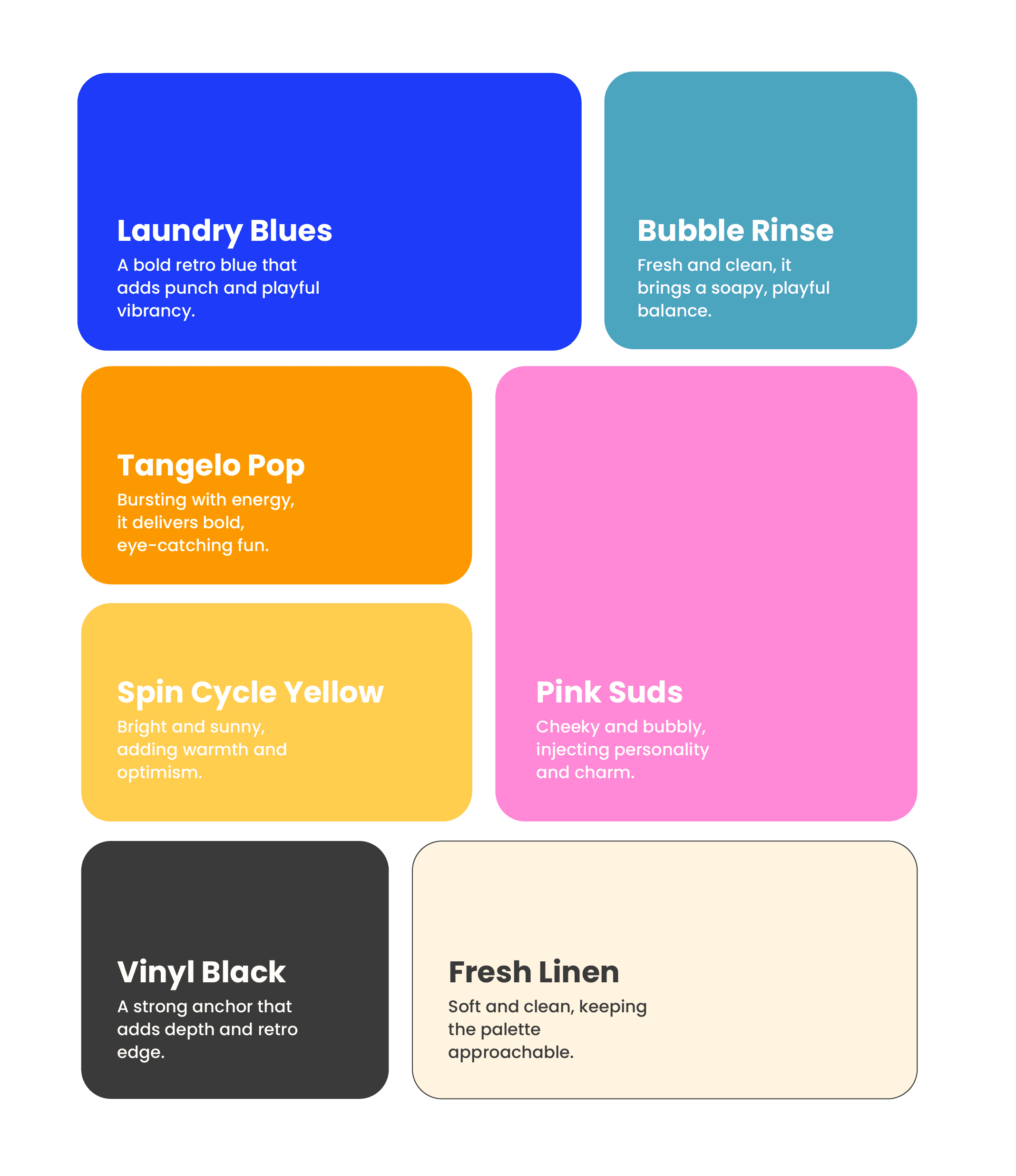
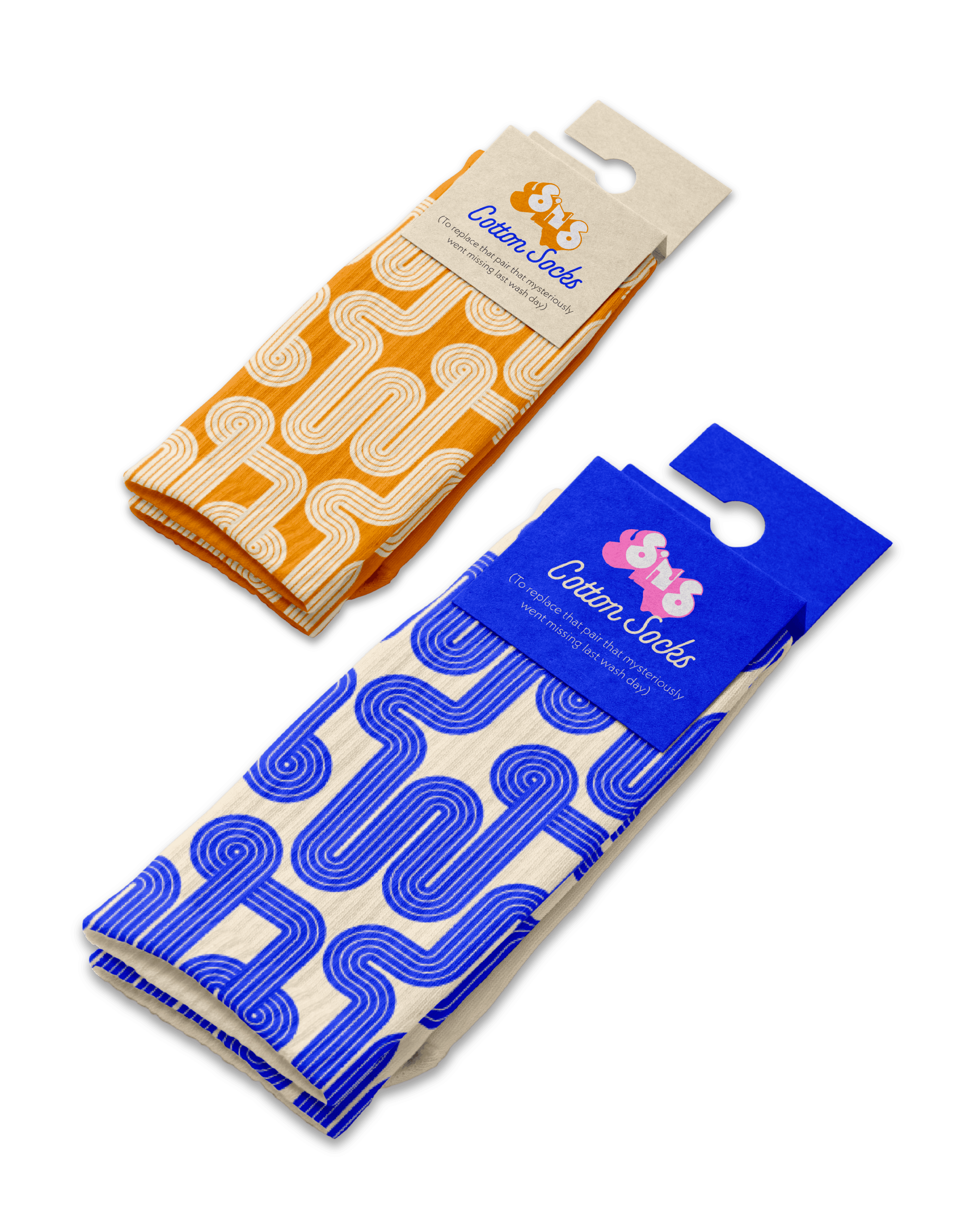
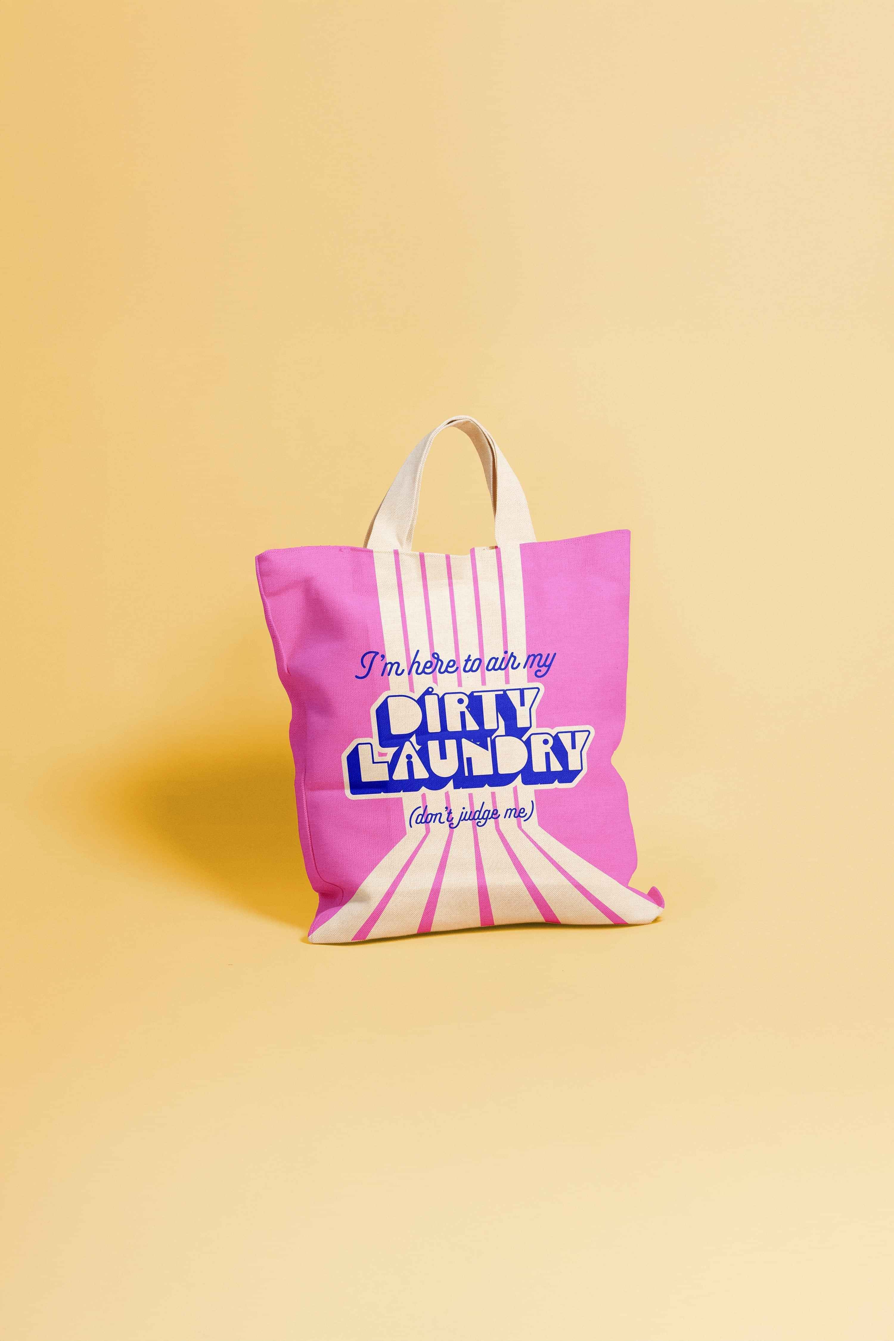
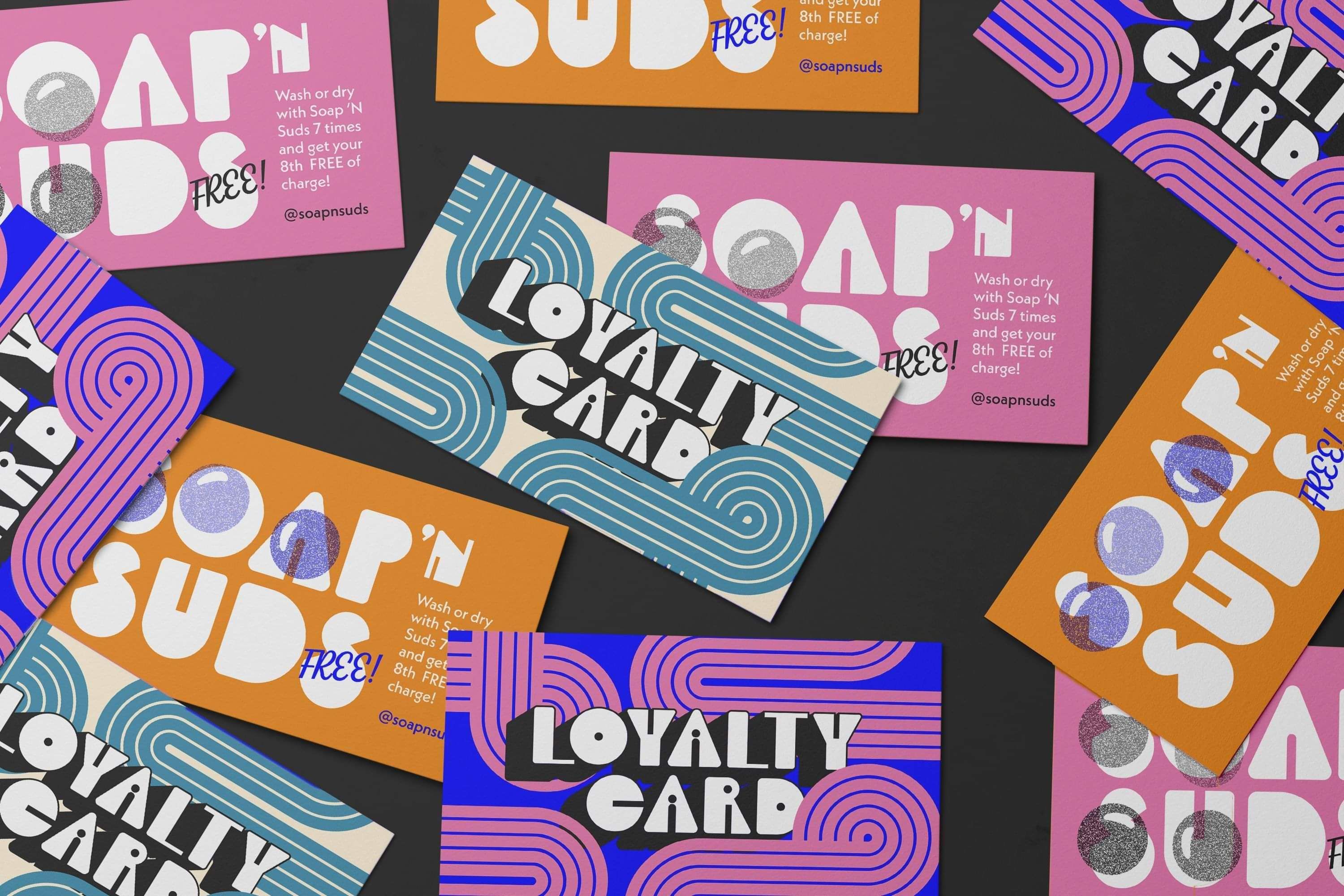
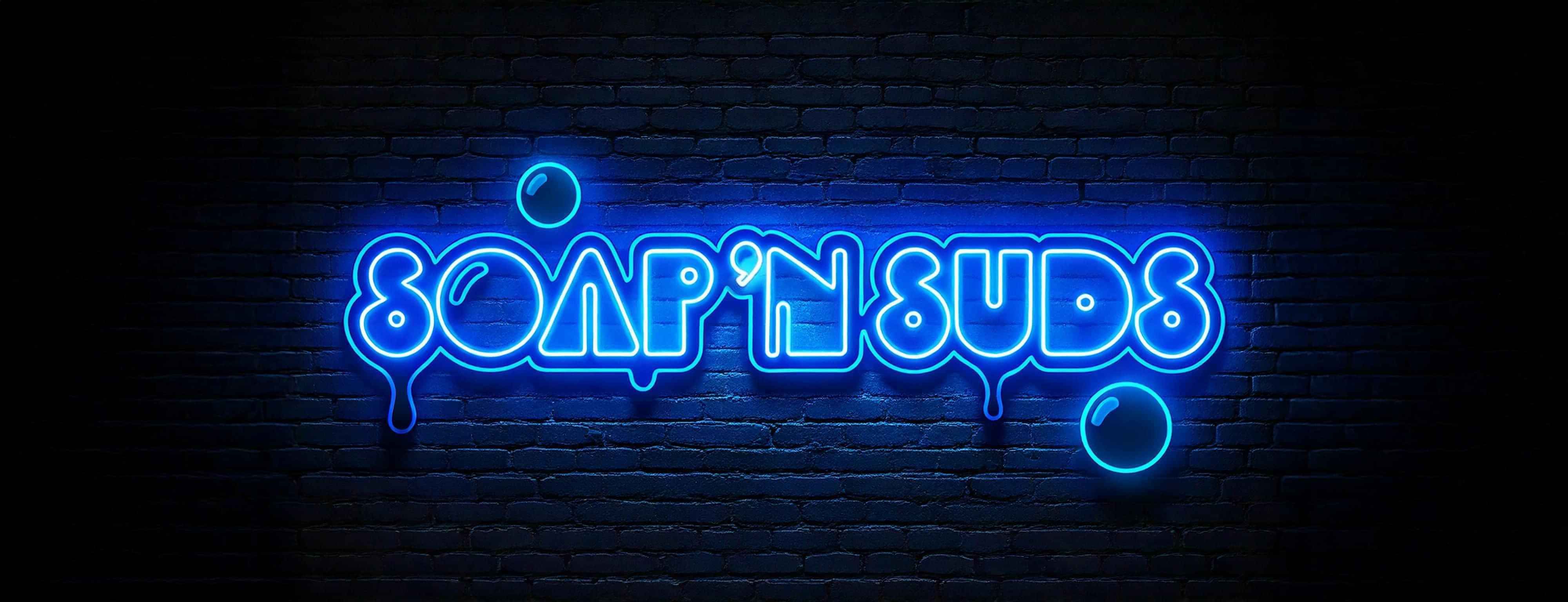
Soap ’n Suds is a retro-modern laundromat concept built to feel bright, friendly, and instantly recognisable. The identity uses bold 70s-inspired shapes, punchy colour, and vintage cues that translate cleanly into posters, loyalty cards, and social promos. The result is playful, memorable, and designed to scale.
Deliverables: Concept strategy, logo direction, colour + type, graphic elements, patterns, mockups
Focus: Retro cues with modern restraint, simple repeatable system, campaign-ready assets
Keywords
Retro
Playful
Memorable
Vibrant
Local
Lively
Ready to Start?
Whether you need a minimalist, clean identity, eye-catching print materials, or bright and bold brand design, our approach is built to help businesses stand out in their own unique way.