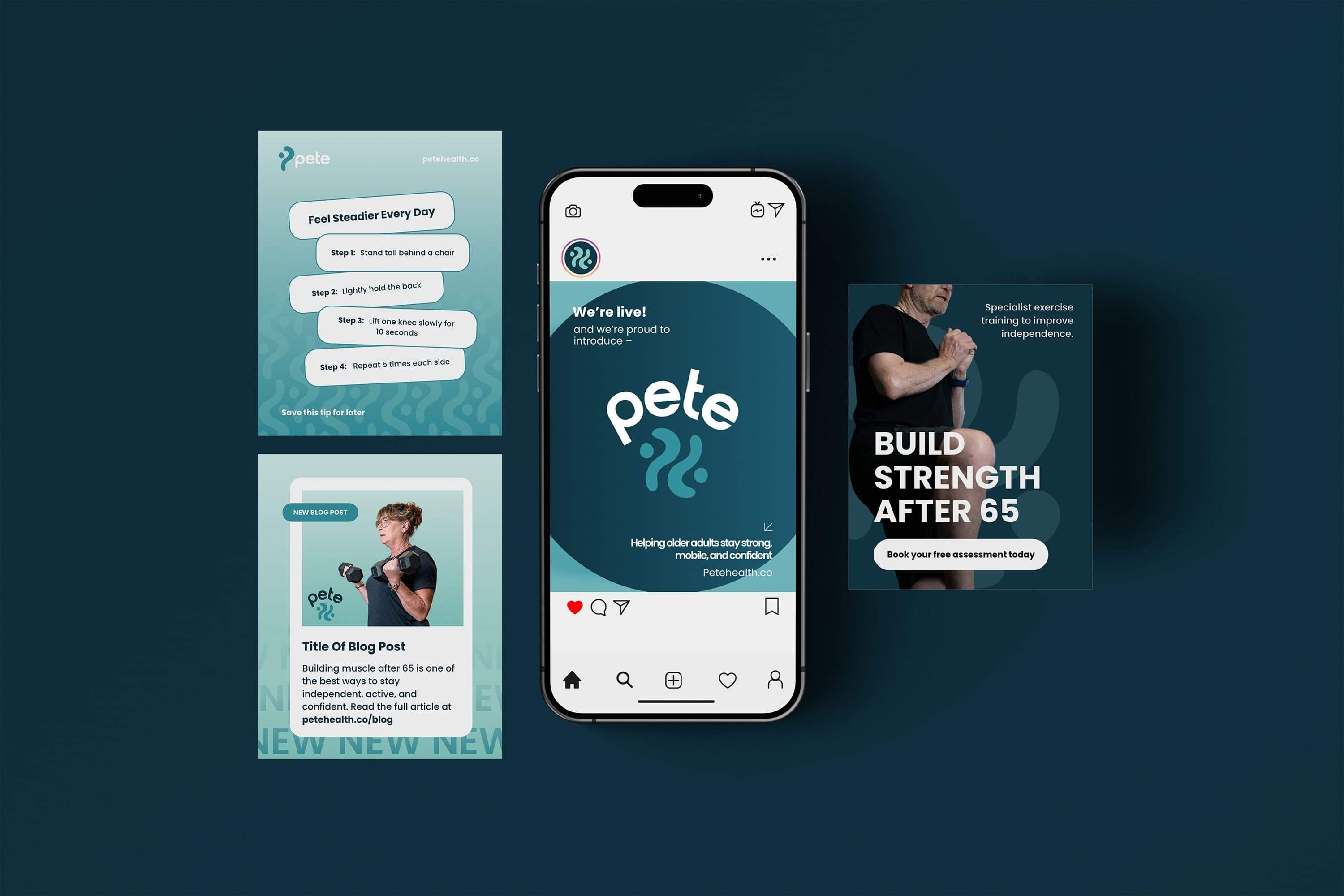
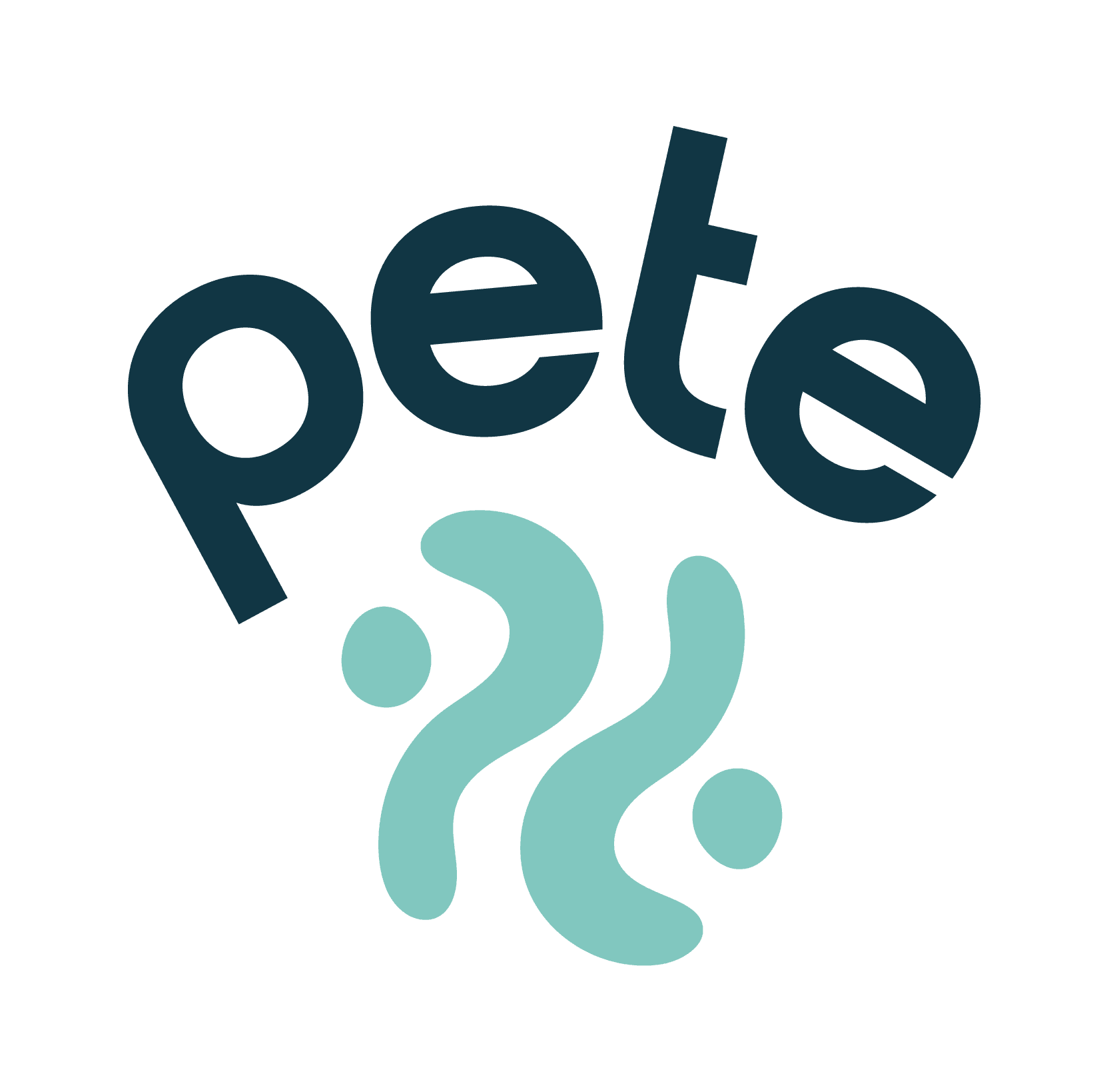
About the Brand
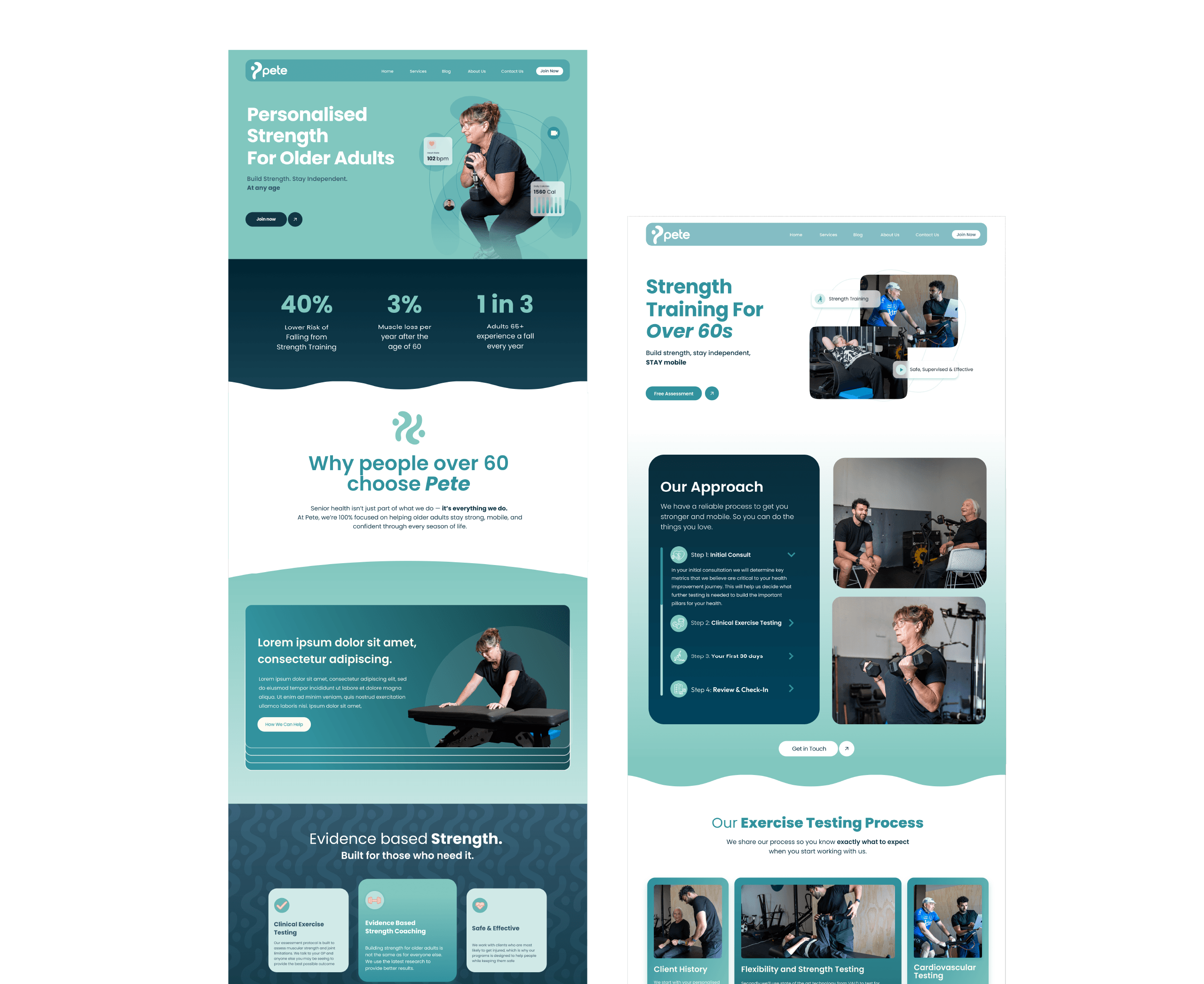
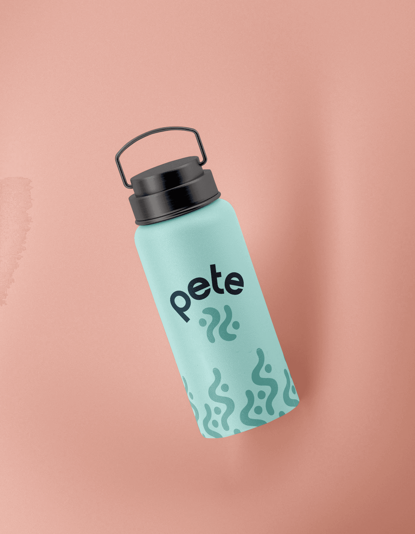
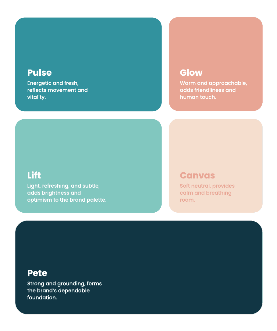
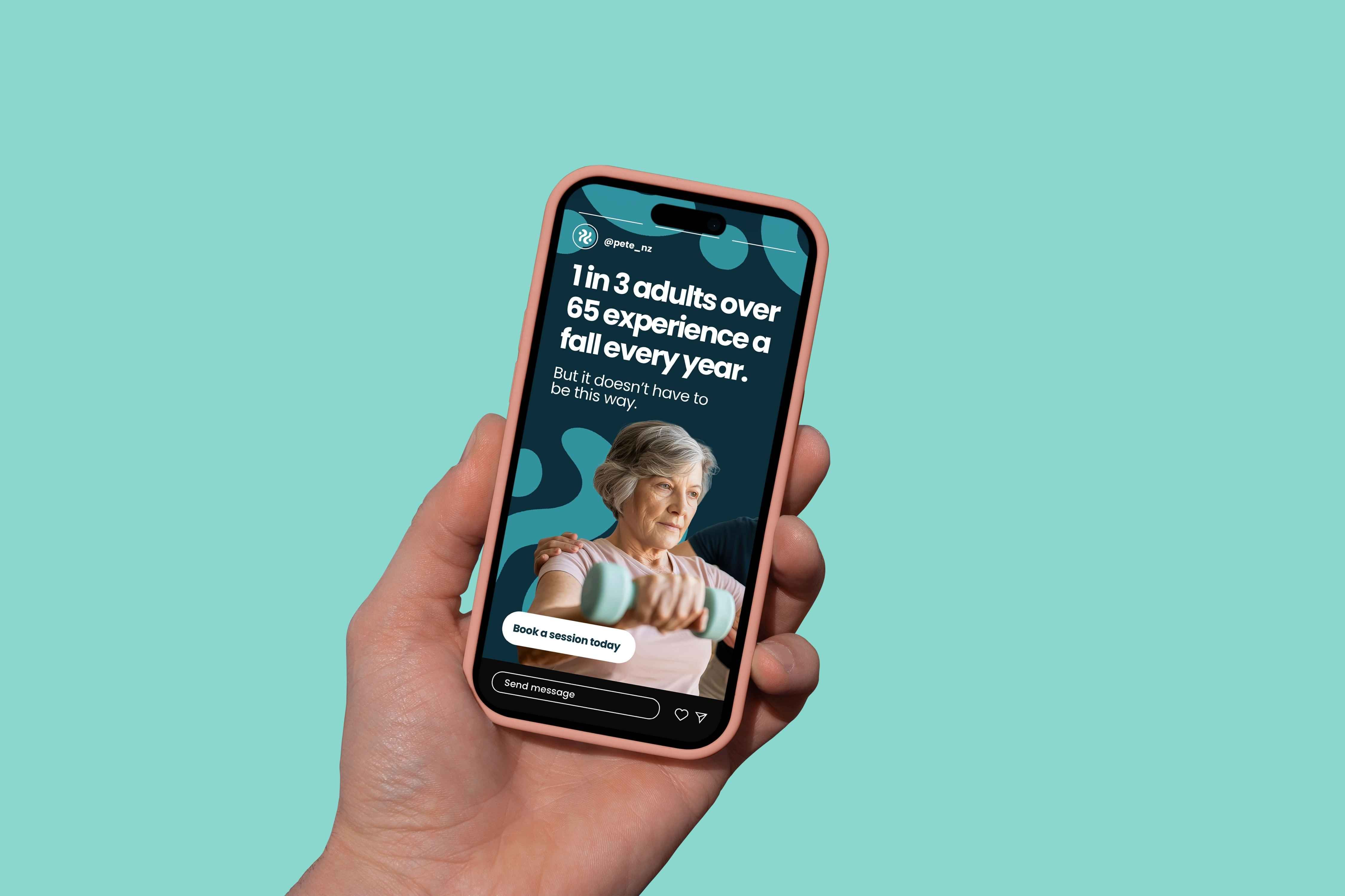
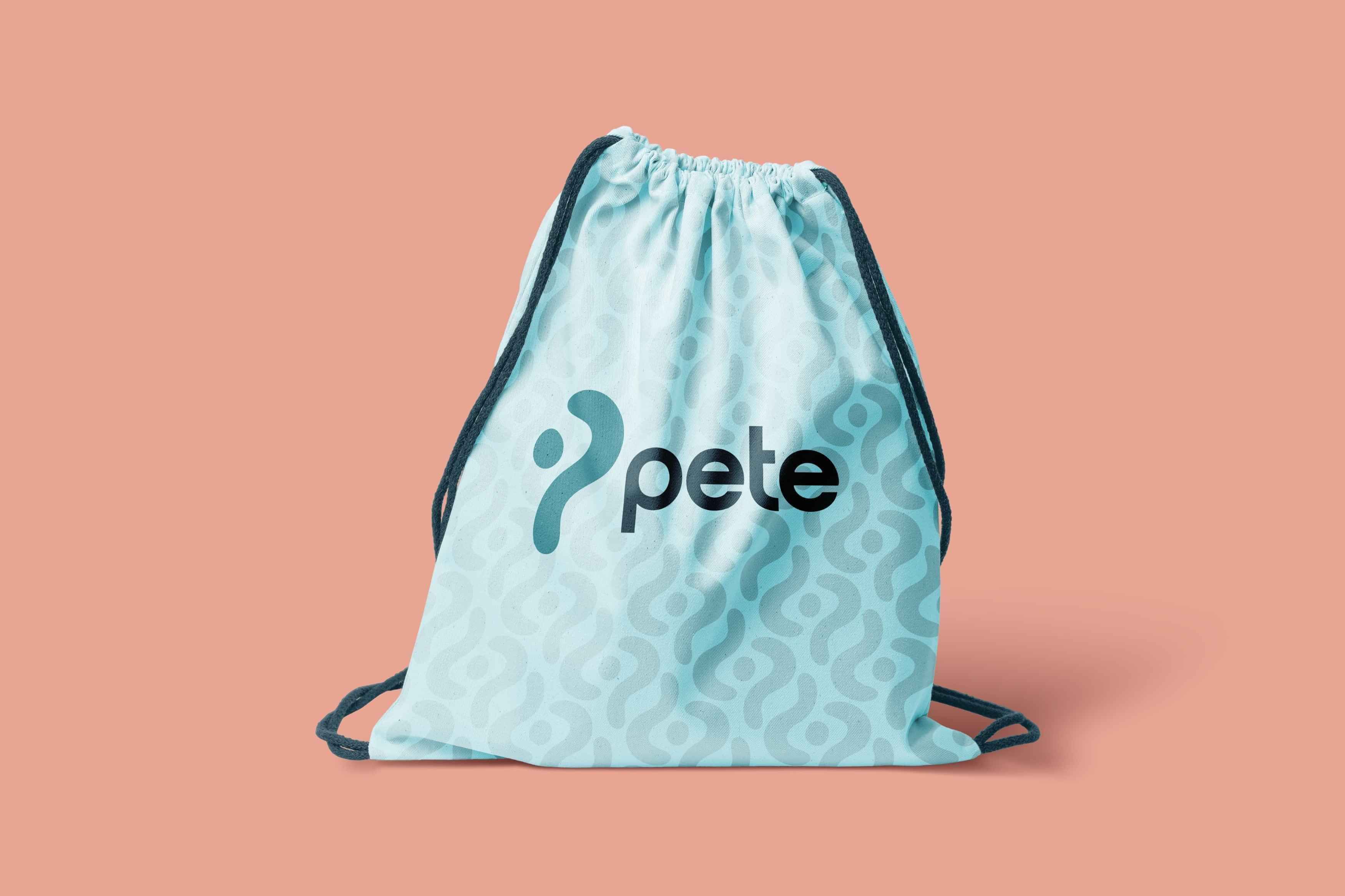
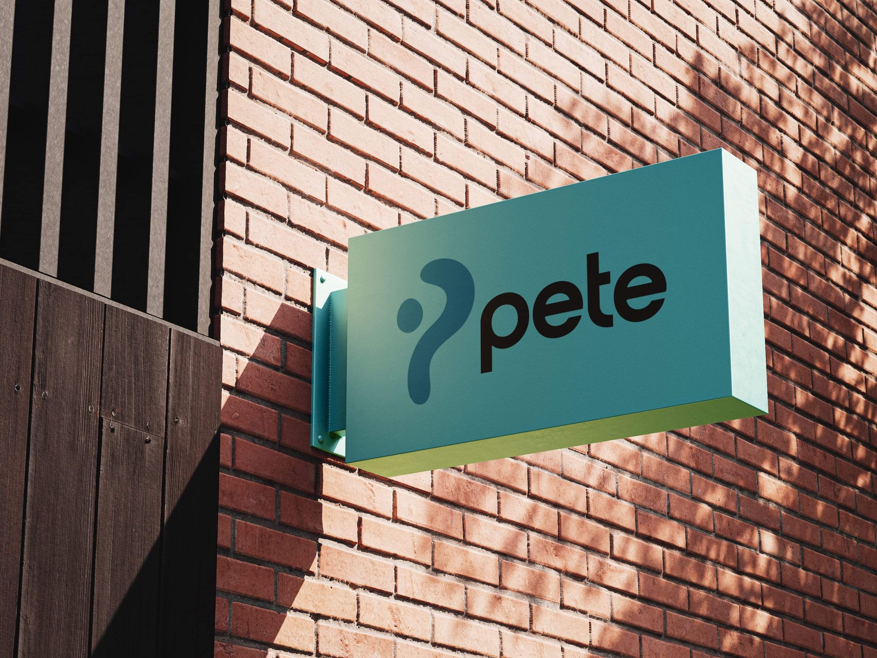
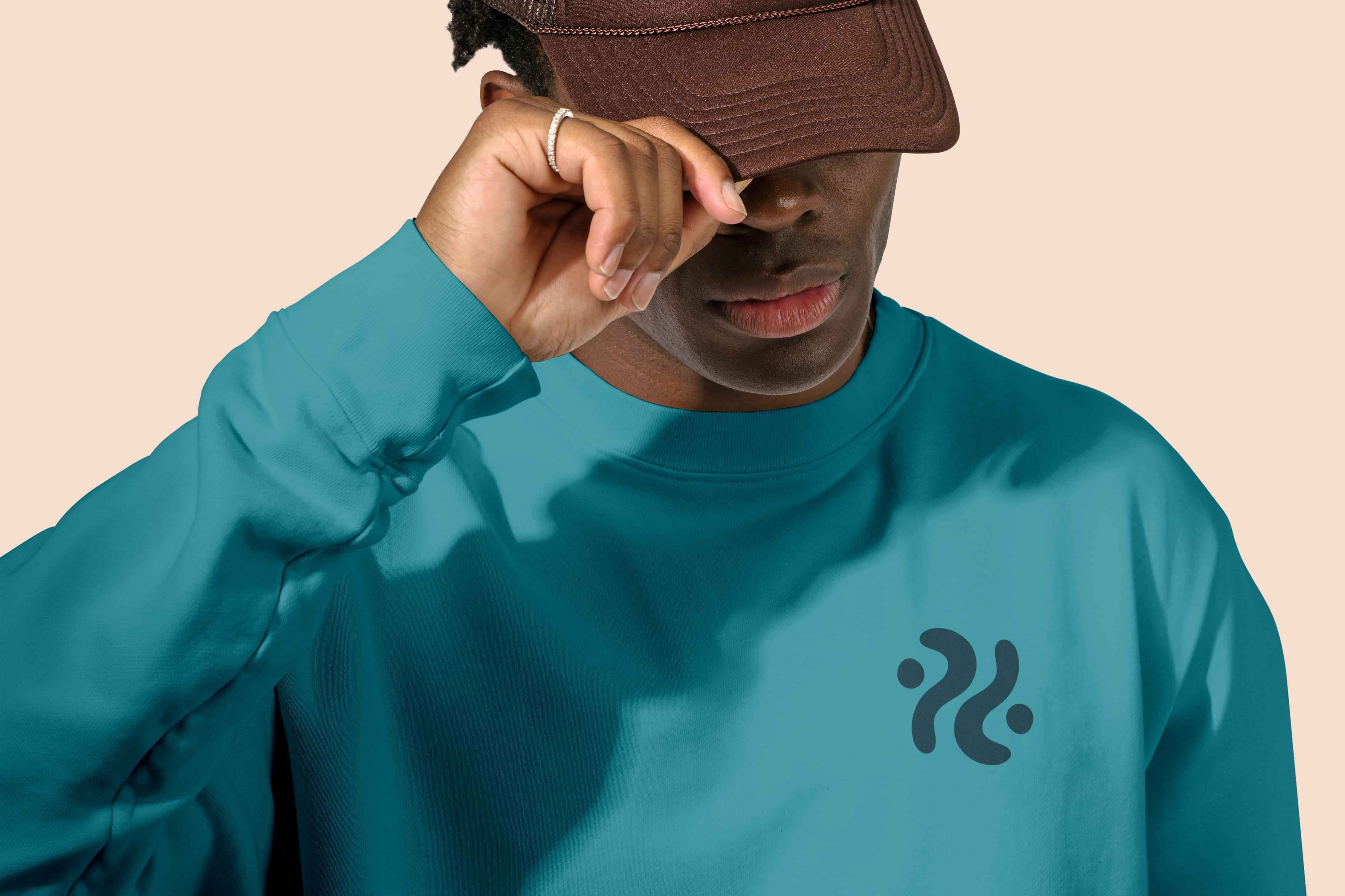
Pete is a physiotherapy brand that supports adults aged 65 and above with strength training and fall prevention. The rebrand focuses on warmth, compassion, and trust, with a clean rounded sans-serif wordmark and subtle human-inspired, natural form icons. The result is a visual identity that feels professional yet approachable, empowering clients to move with confidence.
Deliverables: Brand refresh, logo suite, colour + type, icon/graphic system, brand guidelines, web direction, social templates
Focus: Approachable healthcare tone, clarity + consistency, warmth
Keywords
Movement
Strength
Balance
Warmth
Trust
Confidence
Ready to Start?
Whether you need a minimalist, clean identity, eye-catching print materials, or bright and bold brand design, our approach is built to help businesses stand out in their own unique way.